
Why your best presentation still lost the room
The one slide you’re missing is the only one the VP wants to see.

Last month I watched a Senior UXer give a flawless presentation.
Research was airtight. Designs were clean.
She walked through her process step by step → how she identified the problem, what she tested, how she iterated, what she landed on.
20 minutes. Not a single stumble.
The VP of Product said, “This is great work. Let’s revisit after Q2 planning.”
Translation: this is dead.
She came to me after, frustrated. “I don’t understand. The research supports it. The data supports it. What am I doing wrong?”
Nothing. Her presentation was excellent.
It was also answering a question nobody in that room was asking.
Here’s the pattern I see over and over → in coaching calls, in the newsletters you send me, in the Slack messages from designers who can’t figure out why their work keeps getting shelved.
You prepare presentations around what you did.
Your process. Your research. Your iterations. Your recommendation.
But the people deciding whether your work lives or dies aren’t evaluating your process. They’re evaluating one thing: what changes because of what you did.
That’s not the same presentation.
Think about the last time you presented to leadership.
I’d bet the structure looked something like this:
“Here’s the problem we identified. Here’s what we learned in research. Here’s what we explored. Here’s what we recommend.”
That’s a design presentation. It works beautifully when you’re presenting to other designers or to a PM who’s already bought in.
It falls apart the moment you’re in a room with people who control budget, headcount, or roadmap priority — because they’re listening for completely different things.
They want to know:
What’s the business risk of doing nothing?
Not “users are frustrated.”
How much is this costing us? What gets worse if we wait?
What changes if we do this?
Not the UX improvement.
The metric. The revenue line. The risk reduction. The thing they report to their boss.
What do they need to give up to get it?
Timeline. Engineering resources. Another initiative that gets deprioritized. They’re always making tradeoffs (and if you don’t acknowledge that, they assume you don’t understand their reality.)
What’s the decision you need from them?
Not “thoughts?” Not “feedback?” A clear ask. Green light. Budget approval. Headcount. A specific thing they can say yes or no to.
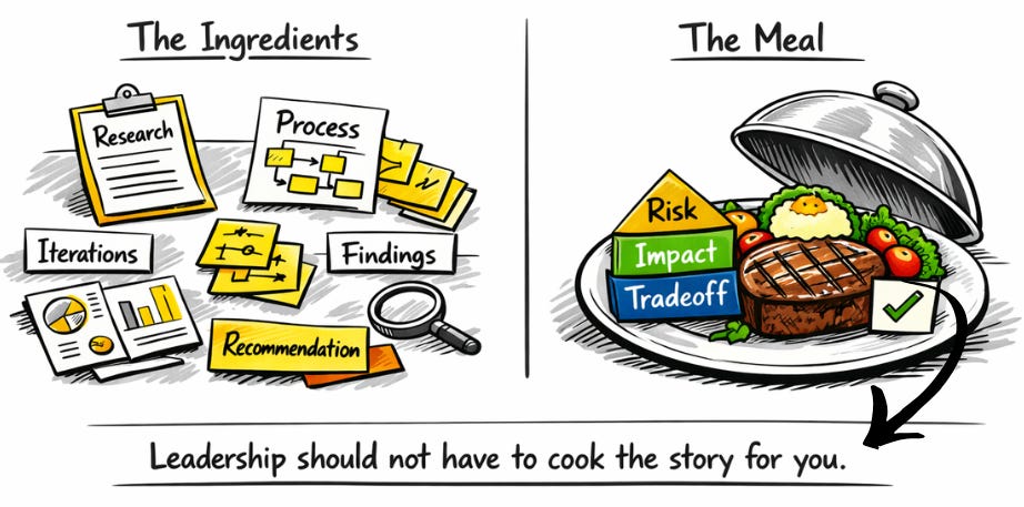
When you lead with process, you’re making leadership do the translation work.
You’re handing them ingredients and asking them to figure out the meal.
The designers who consistently get their work funded, prioritized, and acted on do the translation before they walk into the room.
I want to make this concrete.
Here’s a real before/after from a coaching client (details changed).
🔴 What she said:
“We conducted 15 user interviews and found that 73% of users abandon the settings flow because they can’t find the notification preferences. We tested 3 variations and the simplified hierarchy reduced task completion time by 40%. We recommend implementing option B with the grouped categories approach.”
🟢 What she should have said:
“We’re losing an estimated 12,000 monthly active users in the settings flow → people who came to change their notifications and gave up. That’s contributing to our churn problem. We have a fix that’s been validated. Engineering estimates 3 weeks. If we ship it in Q2, we recover roughly 8,000 of those users monthly and reduce our #2 support ticket category by 35%. I need a green light to add this to the Q2 sprint.”
Same work, but a completely different presentation.
The first version makes the VP think: “Interesting. I’ll consider it.”
The second version makes the VP think: “If I don’t do this, I’m leaving 12,000 users on the table and my support costs stay high.”
One invites consideration. The other creates urgency.
The uncomfortable part is that it has nothing to do with your presentation skills.
You don’t need better slides or to be more confident. You don’t need “presentation coaching”.
You need to start presenting what your work means for the business.
That’s a different skill. And most design education (formal or informal) never teaches it.
We’re trained to show our thinking. To demonstrate rigor. To walk people through how we got to the answer.
But the people who fund design work don’t care how you got there.
They care where it takes them.
This is the core of the Executive Communication track. (not “how to present better”, but how to translate your expertise into the language that actually moves decisions)
If your work keeps getting praised but not prioritized, this is probably the gap.
Going forward, on Saturdays, I’ll introduce concepts. On Wednesdays, paid subscribers get a deep dive + Notion template to practice it.
This coming Wednesday’s template will be the Executive Briefing Builder → a structured prep tool you use before any presentation to leadership. It forces you to lead with impact, not process, and walk in with a clear ask instead of an open-ended “thoughts?”
See you on Wednesday,
📌 Stay Sharp Between Issues
→ LinkedIn — tactical influence plays, posted almost daily at ~8:00 AM EST.
→ My book — practical mentorship frameworks for senior UXers.
Thanks Marina, can’t wait for the templates. This has truly been my biggest blocker for communicating with execs. It becomes a draining experience especially if you don’t realise why your crafted presentations don’t land and instead causing more confusion.
This is great, Marina!
Speak in the language of the room you are in, that way you get listened to and able to translate the required impact.